Elementor Sections, Columns, Margin & Padding explained - WordPress Layout Guide
Elementor is considered one of the best website builders for WordPress mainly because of its wide range of features and ease of use. Simple menus and drag & drop make it easy for beginners to quickly find their way in the world of website building. In this article, we’ll give you a brief overview of the four most important features of the builder: sections and columns, as well as margins and spaces.
This Elementor guide explains where the difference is between section, column, margin and padding. Section controls the rows and must always contain a column. Margin is the outer spacing. Padding is the inside spacing of an element. You need to understand these four terms.
Elementor, like other tools, is easily installed via the WordPress dashboard and there via the “Plugins > Install” function. There is a free and a paid version. The required activation code for Elementor Pro will cost you around $59 a year.
The Elementor layout is structured as clearly as possible to allow for a very intuitive web design. Using the left menu, you select individual elements that you want to add to your page. By clicking on an inserted or already existing element you can format or remove it.
But be careful: If you use Elementor, you have to create the whole page or post (not website) with it – a combination with the normal WordPress editor is not possible.
Sure you can use template blocks and templates, but you should still understand the basics.
Explanation
Although Section and Column have already been translated within Elementor, I’ve also included the English terms in the following table, because many Elementor layout tutorials are also only available in English.
However, Margin and Padding have not been translated within Elementor. I think because these are also the original names of the HTML attributes.
| Name | Function |
|---|---|
| Section | Creates rows of the layout |
| Column | Creates columns within a section |
| Margin | Outer spacing of the element |
| Padding | Inner spacing of the element |
The table should make the terms for page layout creation with Elementor understandable.
The following image shows again exactly how sections, columns, margin and padding relate to each other.
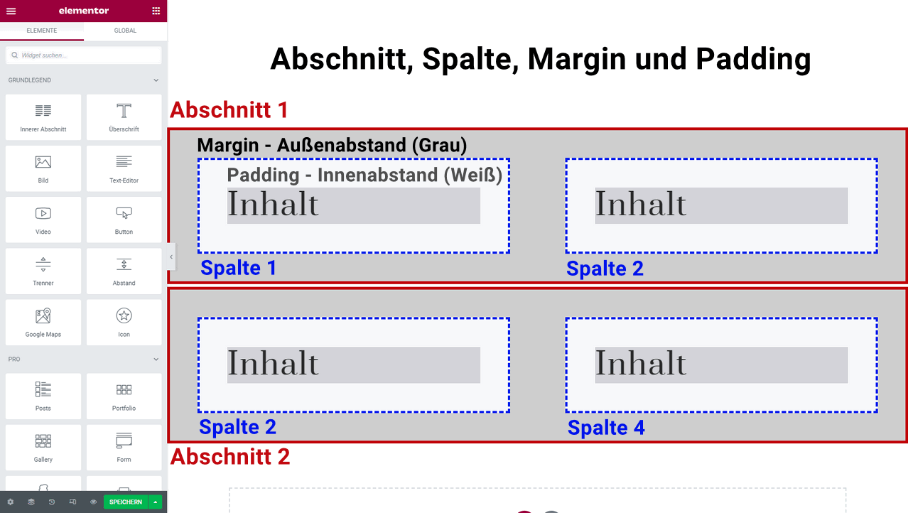
First you always need a section. If you click on the red plus button, you will also be asked to select the number of columns. A section without a column is not possible, and vice versa.
Only then you can move a content element into a column.
In the picture you can also see where the gray margin and the white padding of the columns are located. The frame of the column is highlighted in blue.
Sections & Columns: Basis for Layout Design
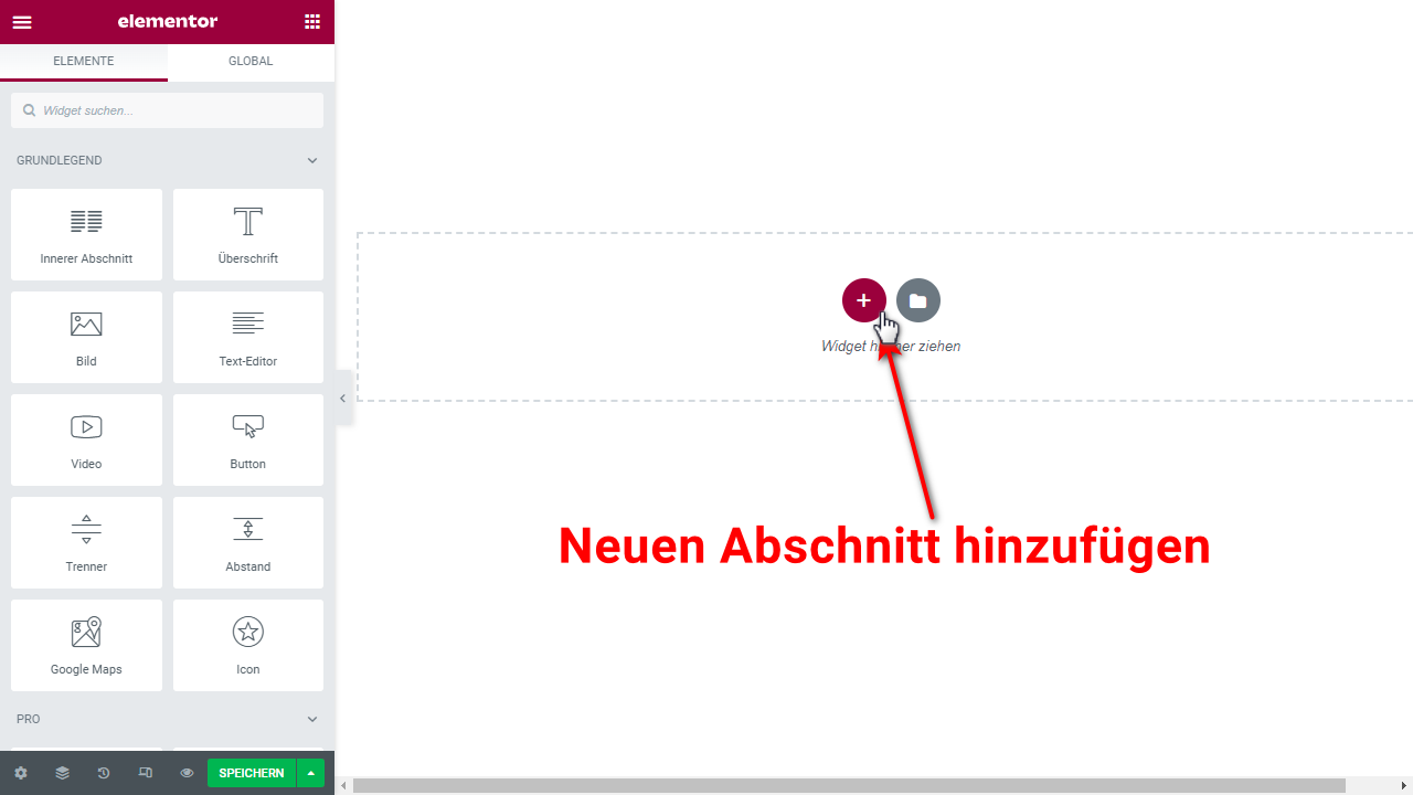
Once in the Elementor editor, add a section by clicking on the “Add new section” button. You can directly select the structure of the section, but this selection does not apply to the whole web page, but only to the current section. You can add a heading and a short text to the section.
In the layout section itself you can neither write text nor add other content. For this you need one or more columns, which are placed inside the section . This selection, which you can change at any time, is made when you add a new section. By default, columns have a width of 1140 pixels, which remains the same even if the user uses a smaller or larger monitor. The section, on the other hand, automatically adjusts to the width of the screen.
Margins & Paddings: For special effects on your web page
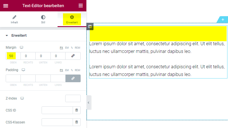
Due to the above explained structure of a web page with Elementor, margins occur in different places: once between the content within the column and the margin of the column itself and once between the margin of the column and the section. The space inside an element is called padding, and the space outside the element is simply called margin. You can effectively use both of these to design your web page, such as to create unique designs and creative style elements.
As mentioned at the beginning of this article, you can change these margins as you wish. For example, if you place a button on your web page and set a spacing of 30 pixels here, with 30 pixels set below the content as well, there will be a total of 60 pixels of spacing between the content and the button. To avoid this, it is important to use spacing and padding wisely for the page design.
Tips & tricks for the placement of columns
Columns within a section cannot be placed on top of each other, but only next to each other . To do this, either add one or more new columns using the small “Plus” button, or click on “Duplicate”, which simply doubles the number of existing columns. Since it is not possible to place one column on top of the other, but it is often necessary, you can do this as follows:
- You place two sections directly on top of each other. In each section you install as many columns next to each other as you need.
- Now reduce the distance between the columns and the upper or lower edge of the corresponding section.
- Visually, your columns will be on top of each other, even if the editor does not support such a placement.
By the way: The name “column” is a bit confusing. In Elementor you can also just place a column in a section and drag or shrink it accordingly.
You can add more columns (intersections or subsections) to your columns. The widget is called“Inner section“.
Arrangement, placement and editing work the same way as for the columns themselves. However, Elementor Layout Intersections allow you to create a more individual and less “straight” design of your website. You can also add an inner section via the left “Elements” menu and drag and drop them into the right column.
This is how you create unique designs!
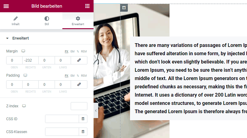
If you classically want to place an image next to a text element within a section, the spacing is the same for both by default. This way, text and image are right next to each other. If you want to add some variety here, you can place the photo lower than the text or even let the image partially “disappear” behind the text. Of course, the whole thing works the other way around, too.
To create these effects, adjust the spacing using the menu on the left side of the editor. To adjust the text to the moved image later on, change the spacing here as well. The Elementor layout offers you the great advantage of being able to experiment at will without causing major damage. If something goes wrong, you can simply undo the mistake using the arrow
Note: By default, the distance is set to “zero”, i.e. neutral. If you enter a positive number, the selected element will move further away from the edge of the column. If you enter a negative number, you can also move the element beyond the edge of the column. This way you can craft fancy overlapping and other effects!
If you want to start with ready-made layouts, you should take a closer look at Elementor Site Kits with lots of templates.
Conclusion: Simple and practical – Elementor layouts explained
Elementor Page-Builder makes it especially easy for beginners to dive into the world of web design . Especially the basic functions, which we have briefly introduced in this article, are sufficient to create first presentable results. Due to the simple structure of the Elementor interface, you simply extend your inserted sections and columns with further required elements.
Now it’s your turn! Design your first Elementor layout structure.
