How Elementor Popup Builder works - How-to
My Elementor Popup Builder Guide. From creating your first custom popup to getting to know all (really all!) the features. A guide for beginners AND advanced users.
With the Elementor Page-Builder you can create full-featured popups and banners without any additional plugin. There is even a separate module for that, the Elementor Popup Builder you create all imaginable popups, slide-ins and bars. Targeting and exit intent included.
Elementor is one of the most used website builders of all time. According to web analytics site w3techs.com, Elementor, along with WooCommerce and WP-Bakery rank in the top three spots in the popularity rankings. In April 2022, the all-time popular WordPress plugin ranked number two1, beating its competitor WP-Bakery.
Reason enough for the editors of bloggerpilot.com to document what can be done with the successful content management system. On this website you will find a lot of exciting information about the topic. This article is all about the popup builder from Elementor. You will learn everything you need to create ingenious popups with Elementor. So we’ll get right into the practice, and show you how to create an Elementor popup.
This is how you create an Elementor popup step by step
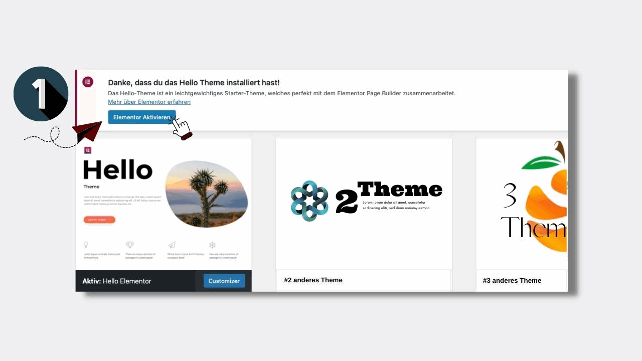
1. Activate Elementor
Once you’ve activated the website builder, you’re ready to go.
2. Choose Elementor Pro
Many of Elementor’s features are available to every user for free. However, to create a popup, you need Elementor Pro
Note: If you are already using Elementor Pro, skip points 2 to 5 and continue with “Add popup” from point 6. For everyone else, here’s how to install the paid website builder
3. Create popup
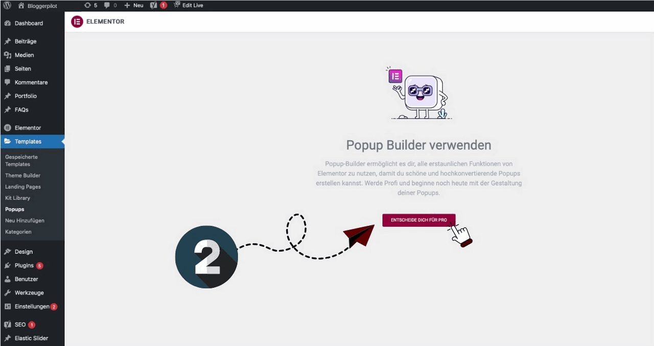
Go to Menu Templates > Popups and click on “DECIDE FOR PRO” to start creating popups.
4. Download Elementor Pro
A notice will appear informing you that plugins will only work with the paid version of Elementor.
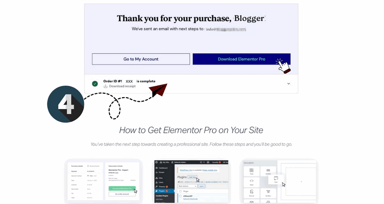
Get Elementor Pro and follow the steps on its website. After the purchase, the file to be installed on your website will be available for download in zip format. After downloading, go back to your website and upload the file by clicking Plugins > Install. The installation takes only a few seconds. After the installation, a message will appear
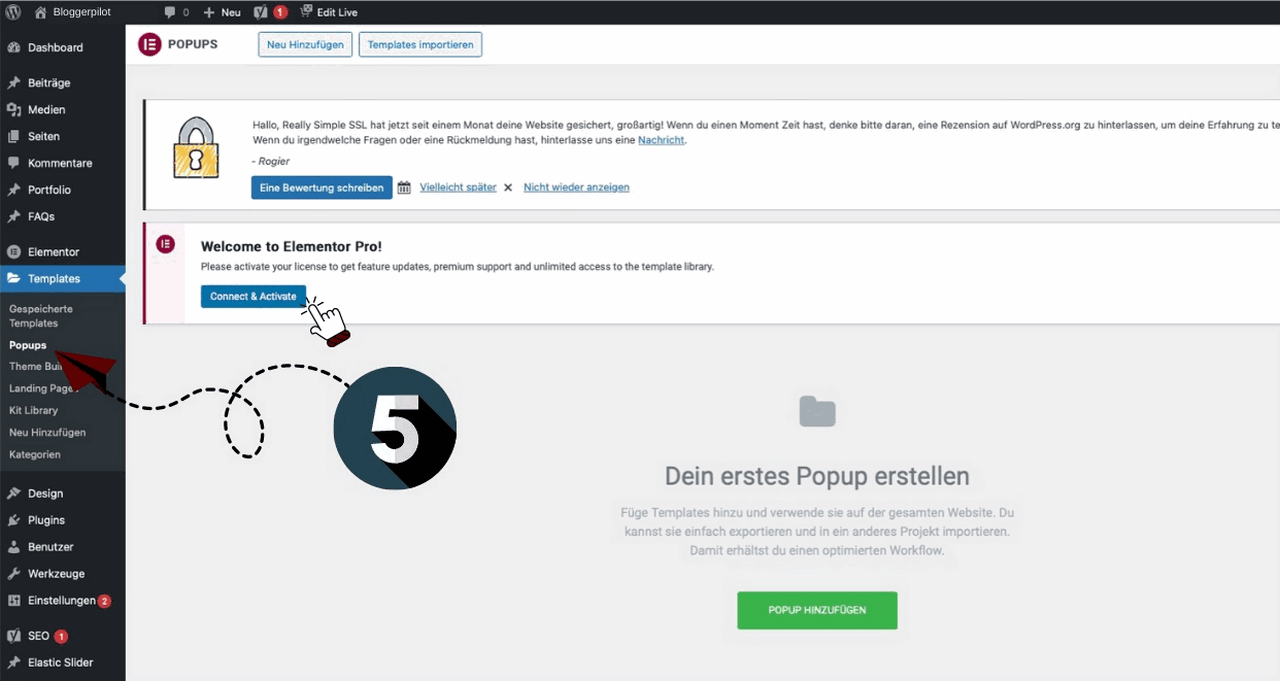
5. Activate Elementor Pro
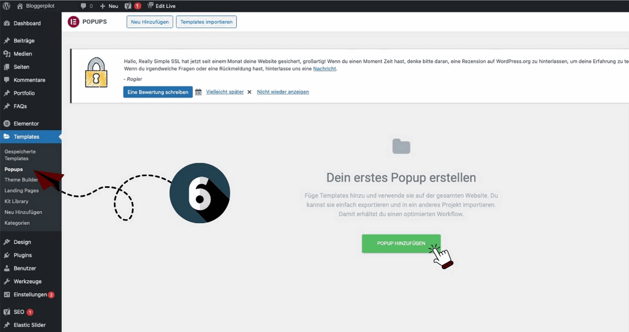
6. Add new popup
Now it’s finally time to get started. After clicking “Add Popup” a new window will open.
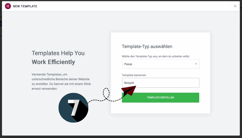
7. Assign & create template name
Name the popup. Choose a unique name with recognition value. This makes it easier to keep order and to find templates even after a long time. Click on “Create template” to get to the next input mask
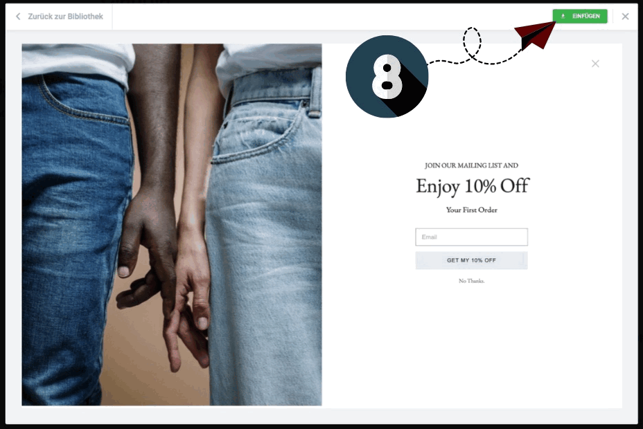
8. Select popup template
Choose a template from the template library (“Popup” tab). Use the magnifying glass icon to preview the template before making your final decision. Once the decision is made, click on“Insert“. The popup editing mask will open.
The example shown here is a full screen pop-up. A list of the 6 popup types with a short description can be found further down in the text.
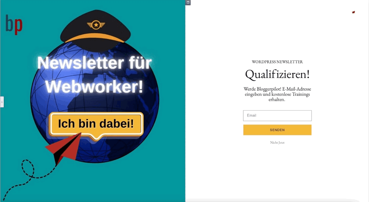
9. Edit template
In this example
- replaced the image with your own design
- adjusted the text and
- changed the color of the button.
By clicking on the poison-green save button in the lower left corner, another editing mask opens, where you can make some more settings.
By the way: The most important tools for editing and customizing your popup can be found below.
10. Set the settings
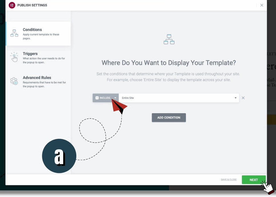
a. Conditions (Apply current template to these pages): Choose on which pages the popup should appear. The template can appear on the entire website or on any individual pages. Conditions would be called conditions in German. With these conditions you determine when and where your forms are displayed.
In this example the implementation pops up on every single page.
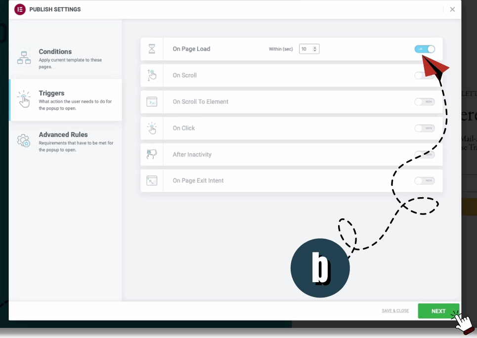
b. Triggers (What actions the user needs to do for the popup to open): Here you define which action precedes the opening of the popup. These are the triggers.
With the variant shown here, the popup appears 10 seconds after the page is loaded
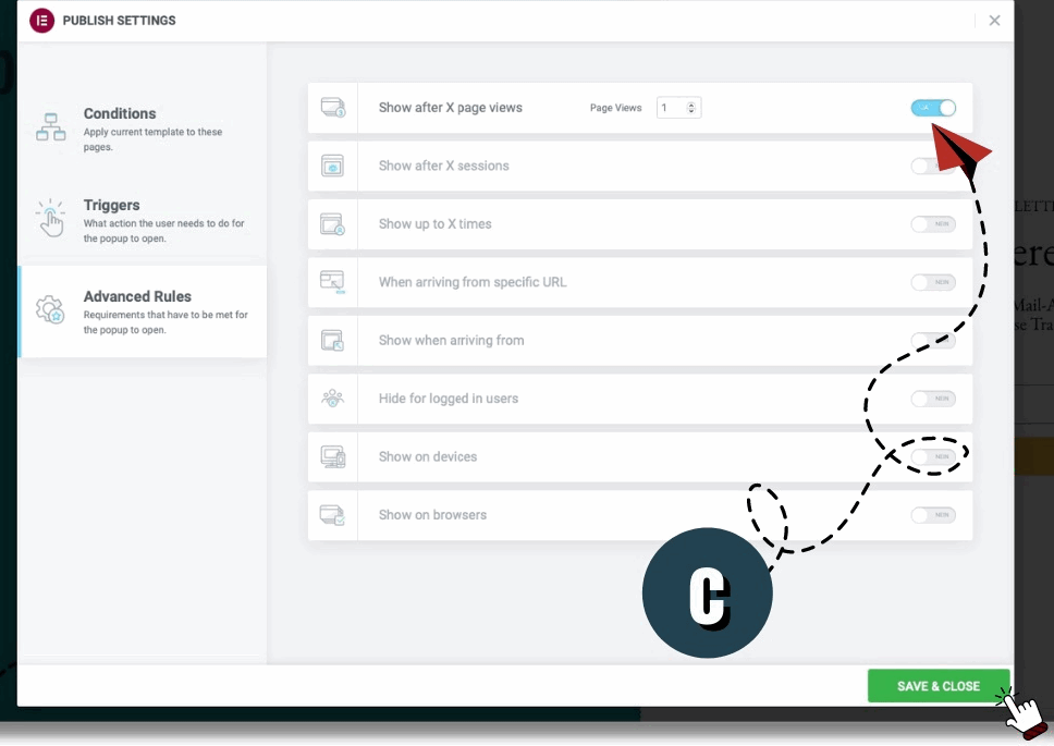
c. Advanced Rules (Requirements that have to be met for the popup to open): Here you define which requirements have to be met for the popup to open.
In our example, the Elementor popup opens after viewing a single page.
11. Finish
Click on“SAVE & CLOSE” to finish creating the popup.
Create popup from the template library: Quick, easy and appealing
Work with an Elementor popup template to:
… place a gallery of multiple images in the popup layout: Slide-In
… design a popup menu for the website: Slide-In, Fly-In
… link to another page: Classic
… draw attention to your social channels in addition to the campaign: Fly-In
… place an important notice or welcome that will be closed manually (or automatically) after reading: Classic and Fly-In
… to design a cookie popup: Classic, Bottom Bar or Hello Bar
How to create an Elementor Cookies popup
Cookie popups look very simple in themselves – but the effort to create them manually is absolutely not. The problem lies in the programming that runs in the background. So, in principle, it is possible to create a cookie popup with Elementor – but it is rarely actually used. Not even professionals who know all the steps inside out work with Elementor’s popups program to design cookies. It is faster and easier to design a cookie popup with the appropriate plugin. So why waste time unnecessarily?
The Bloggerpilot editorial team’s recommendation for designing a cookie popup with Elementor is the free Cookiebot from Munich-based usercentrics GmbH. The usercentrics GmbH provides a Consent Management Platform (CMP) for companies of all sizes – from freelancers to corporations – which allows for easy documentation and management of user consents
Here’s how you, as an Elementor user, create your cookie popup using the Cookiebot:
- Go to the cookiebot site.
- Register for the free version.
- Enter the registration key that arrives via email on the Cookiebot website.
- Settings in DOMAINS tab:
- Enter the URL of your website (e.g. https://bloggerpilot.com)
- DIALOGFIELD tab settings:
- Choose the appropriate template. Tip: Swift template offers responsive design, so it will be displayed on tablets and cell phones as well.
- Select the position of the popup. Tip: The banner at the top of the screen is particularly discreet. On the other hand, if you want the popup to be eye-catching, Overlay or Popup is the appropriate template
- Select the method of consent.
- Select option type. Tip: For small pages “Accept/Reject” is enough
- Check the SHOW CLOSE SYMBOL IN BANNER checkbox to display the “X icon” on the screen (allowing the user to easily click away the popup).
- WIDGET tab
- Select the position for the element.
- You don’t have to worry about the default spacing settings. You can always change them later (which is usually not necessary).
- Decide on a color theme to visualize “widget open” and “widget closed”. Tip: In most cases, website owners opt for the default “widget-open-white” and “widget-closed-black”.
- CONTENT tab
- Choose the language in which you want the plugin to be displayed.
- Customize the content of your brand communication accordingly.
- YOUR SKRIPTS tab
- You don’t need to change the default settings in this tab
- Copy the first script
- Go to the Elementor > Custom Code menu.
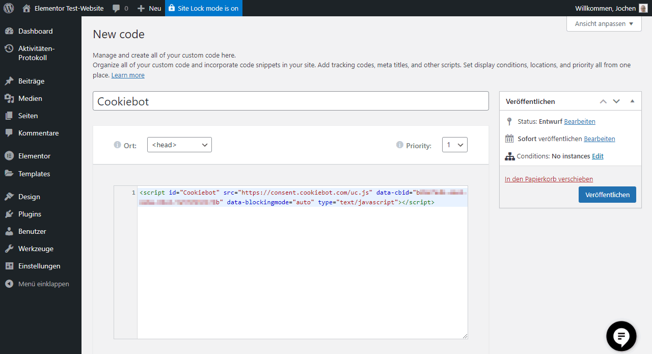
- Paste the script you just copied from Cookiebot into the code block and save the change by clicking“Publish“.
- Create a new page with a name like “Cookies Information”.
- Go back to the Cookiebot page and copy the second script.
- Edit the just created new page “Cookies Information” with Elementor. Drag an HTML element into the editing window and paste the second script into it
- Save your changes.
Now you have a cookie popup created with Elementor that actually meets all legal requirements. Good. A little help from a plugin was also included. But it’s much easier this way. And it’s also compliant with the GDPR. Cool, isn’t it?
6 popup types
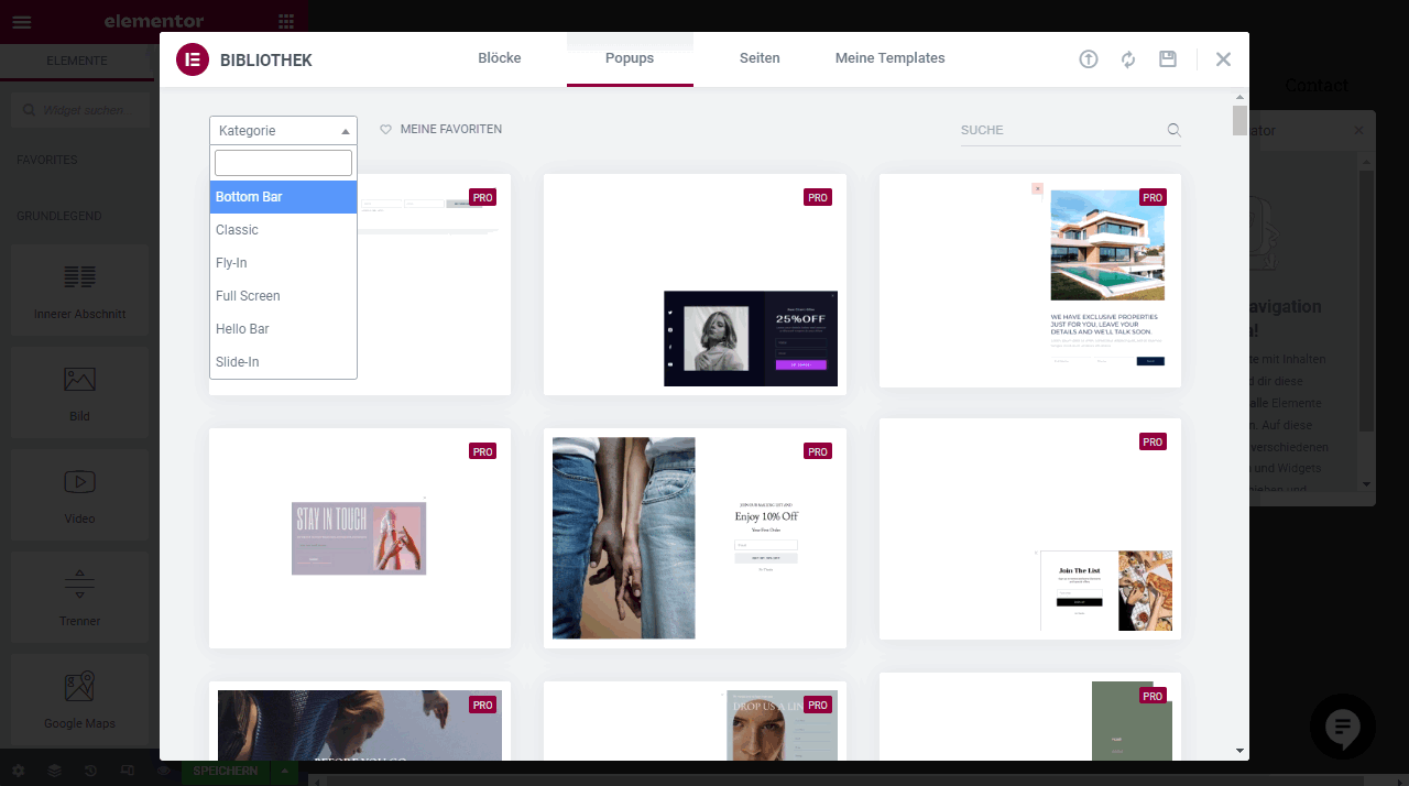
Elementor’s popup templates are divided into 6 categories
- Bottom Bar
- Classic
- Fly-In
- Full Screen
- Hello Bar
- Slide-In
1. Bottom Bar
A discrete bar appears at the bottom of the screen. If you like the design of a bottom bar, but would like to place it at the top, this is also possible. See the next point Tools for editing and customizing an Elementor popup
Bottom bars are suitable for those who want to place an unobtrusive notice, and more text than image. Inserting images is possible, but they appear relatively small in contrast to Classic or Full Screen popups.
2. Classic
The window appears in the middle of the screen.
Not quite as discreet, but classic. Here it may be a little more conspicuous. The Classic popups are well suited for placing not only text, but also images.
3. Fly-In
The popup moves into the screen from any direction.
Fly-Ins call for attention through movement. Here, too, text and image can be combined
4. Full Screen
The window fills the entire screen.
A popup that really can’t be missed. Especially suitable for transporting a message through images.
5. Hello Bar
The popup appears as a bar at the top of the screen. If you like a Hello Bar design, but would like to place it at the bottom of the screen, make these changes in the settings. See the subsequent item “Tools for editing and customizing an Elementor popup”
Here it becomes – as with the bottom bar – a bit more discreet again. Bars are suitable for transporting text. For images they are not so good, because they get only little space in the window.
6. Slide-In
The window slides sideways into the screen.
Like the fly-in, the slide-in aims to attract attention through movement
Tools for editing and customizing an Elementor popup
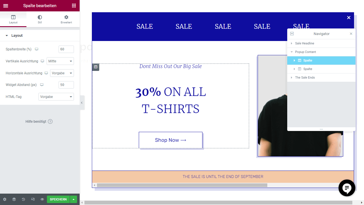
All Elementor templates are customizable. However, before we can start presenting individual tools and functions for editing popups, we need to familiarize ourselves with the Elementor popup interface. If you have already worked with Elementor, you already know these functions
The function menu
The function menu consists of 4 different function clusters:
- Edit Section or Section
- Edit Column
- Edit Popup
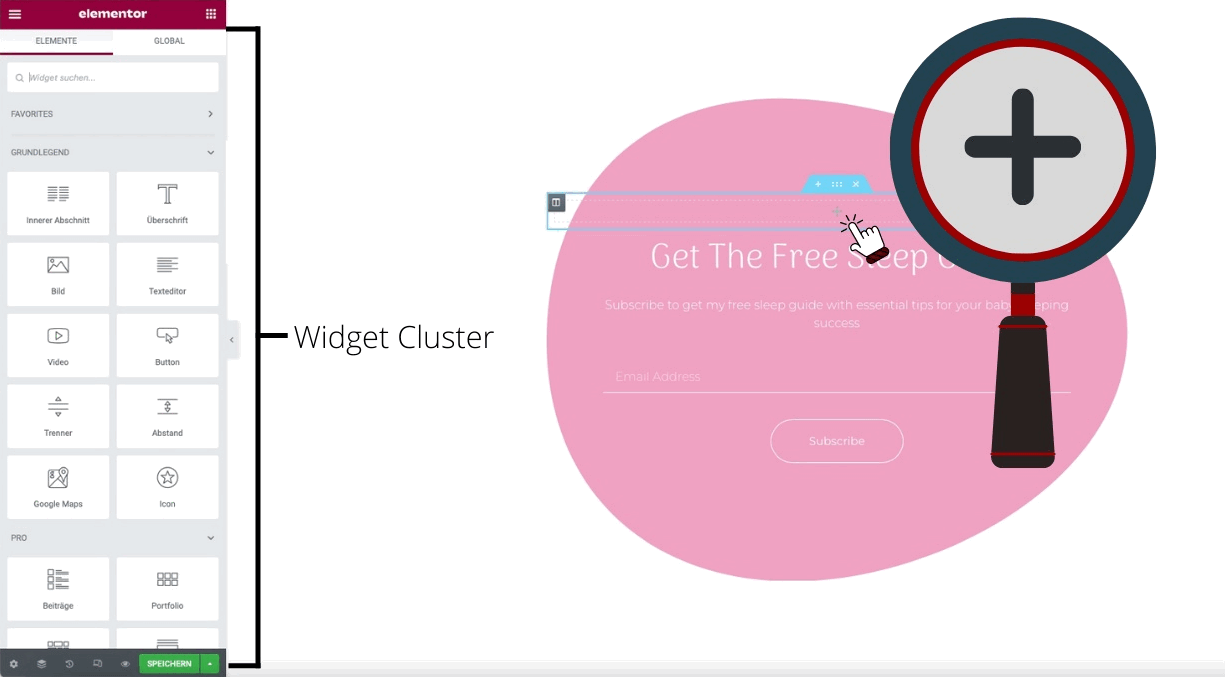
- Elementor Widgets
Tip: Learn everything about sections, columns and elements.
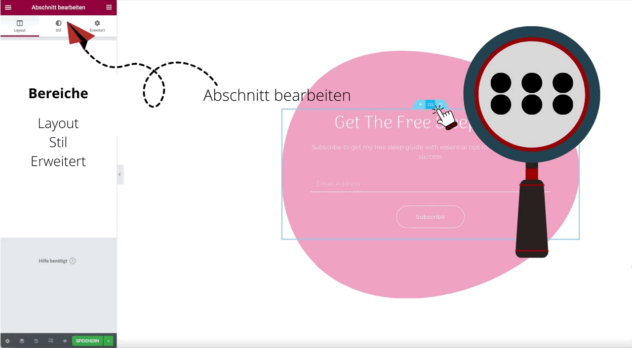
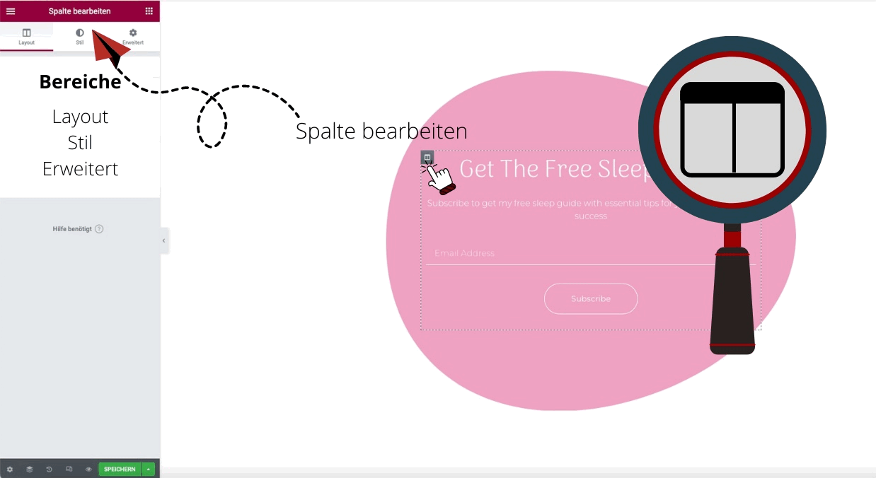
Each cluster offers a wide range of functions, each of which is located in three tabs:
- Main Functions (Content or Layout)
- Style
- Advanced
In the main “Content” and “Layout” sections, you can make basic changes to your popup (e.g. insert text or image, adjust proportions)
In the Style section you can set the colors, border options and typographies of the text.
The “Advanced” section allows you to customize your Elementor popup even more precisely. Here you can change the movement effects of individual image and text elements and set up the popup as a responsive design (or switch off the Responsive function)
This is how you switch between the individual function clusters
Edit section
Edit column
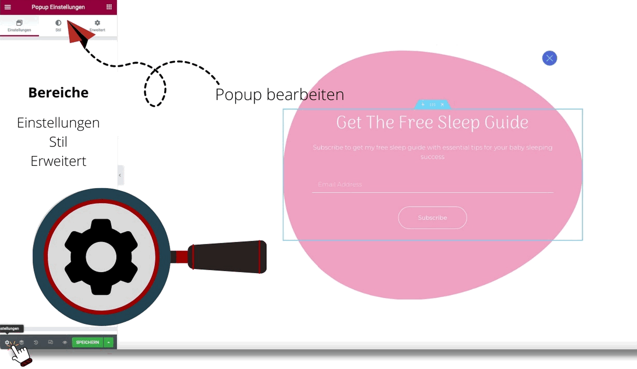
Edit popup
Widget Cluster
Editor’s tip: To better orient yourself within the popup menu, click on the navigator, which is the “3-paper layer icon” at the bottom of the function menu with a dark gray background (where the save button is located).
Individual functions for popup editing
Let’s continue with the detailed functions.
Insert image
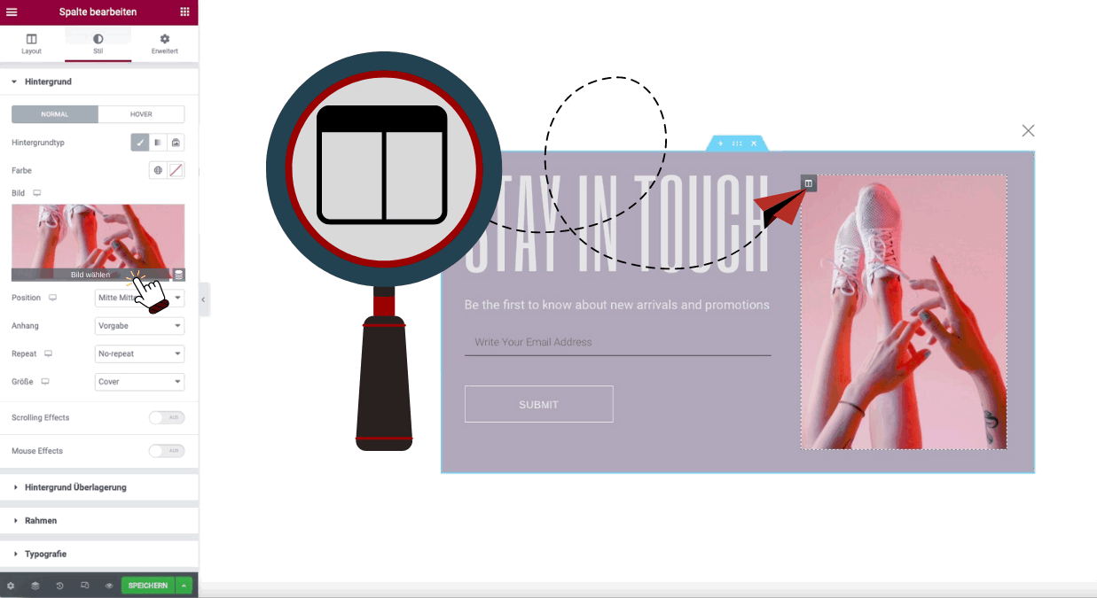
- click on the column icon to get to the right layer
- click on “Style” in the “Edit column” sidebar
- Move the mouse cursor to the thumbnail and click “Select image
- Upload image or select existing image from media library
Dynamic image attributes
You use the dynamic image attributes when you want to set an automatic design for a certain content type (page or post). We will not go into this further in this post.
Customize text
- Click in the text field
- Triple-click to select all text in the text box
- Overwrite text
In the text fields, it is possible to overlay a link. This works, as usual in Elementor, with marking the text and depositing the URL in the field provided. The vertical and horizontal alignment as well as the line spacing of the text can be changed in the >>LAYOUT tab.
Change font size
It is not possible to change the font size in all cases. For example, in the case of the plugin used in the “Insert image” section, it is generally not possible to change the font size. In these cases you simply replace the column with a new heading. To do this, click on the “pencil icon” >>DELETE, and insert a new heading or text editor element
Change column width
You can change the column width under >>LAYOUT >>COLUMN WIDTH.
Change Elementor Popup Layout
To change the layout, click on the cogwheel icon in the lower left corner. In the settings you will find the following functions:
Change width
The width of the popup can be calculated by pixels (px) or variable (vw).
Change height
Here you have three options. The height of the popup can affect..
- … to the content of the popup
- … align to the width of the screen
- … or be custom made
custom
Change position
The position on the screen is always freely definable – no matter which template you choose. Simply create a bottom bar from a Hello bar – or vice versa. You can find the corresponding function in the settings under “Position”. A more precise determination of the position is possible by setting the outer and inner distance under “Advanced”.
Enable or disable overlay
If you deactivate the overlay, the popup will appear together with an overlay as a (transparent) layer on top of the content. If you enable this feature, your page will automatically be overlaid with a color that matches the popup. The color of the overlays can be changed under Settings > Style > Overlay
It is also possible to install your own image as an overlay. For smaller graphics or pictograms, the position and size can be freely determined. For large, screen-filling graphics, this function is meaningless. By the way, the repeat function displays the small graphic or pictogram repeatedly in a row
Hide close button
This function hides the “X” for closing the popup. But beware This option forces the user to use the button. If this click leads to a page that the user does not want to go to, this can lead to a bounce. The better variant: Show close button only after a certain period of time. You can set the time until the close button appears under the “Advanced” tab.
The position and size of the close button can be set via Settings > Style > CLOSE BUTTON.
Ideal for friendly welcomes or friendly reminders that pop up and disappear after a short time: Advanced > Automatically Close After (sec.).
Animation
Here you decide in which way the Elementor popup should appear or disappear on the screen. You are not bound to the fly-in and slide-in functions from the templates, but modify the movement of the popup according to your own wishes. You can see the animation in the preview – this is the eye icon located at the bottom of the settings window. All options can be set as input or output animation.
- Fading: The window will be faded in
- Zooming: According to its name, the window is zoomed into the screen
- Bouncing: The window bounces back and forth a few times while fading in.
- Sliding: Similar to fading, the window moves into the screen
- Rotating: the window rotates before stopping at its position
- Attention Seekers are especially eye-catching:
- Bounce: jumps up and down a few times
- Flash: lights up a few times
- Pulse: pulses a few times
- Rubber Band: pulls apart and together like a rubber band
- Shake / Head Shake: shakes before stopping
- Swing: swings back and forth as if it were attached to a nail
- Tada: swings and bounces at the same time
- Wobble: swings back and forth as if attached to a stand
- Yello: pulls like a rectangle of rubber in different directions
- Light Speed In: moves into the screen similar to the movements of a fast car
- Roll In: makes a roll
In the Animation section you can also set the duration of the animation (0.1 – max. 5 seconds).
Editor’s tip: In the settings you can change the name of your popup again afterwards, if you have found a more suitable name.
Add frame:
Settings > Style: Here you have 5 frame types (dashed, dotted, solid line, groove, double line) at your disposal. You can choose the frame color and the radius of the frame (for rounded corners).
Do not show popup on tablets and smartphones
Section > Advanced > Responsive > Visibility. Select which screens should not play the popup (desktop, tablet, mobile)
Make popup responsive:
Section > Advanced > Responsive. Here it is possible to invert columns to be able to play them legibly on mobile or tablet as well. Check out the mobile or tablet preview by clicking on the “PC & Mobile icon” at the bottom of the function menu with a dark gray background (where the settings and save button are also found)
Add shadow:
Settings > Style > Box Shadows
Change background color:
Settings > Style. The choices are solid and gradient. The type (linear or radial) and the angle of the gradient are freely selectable
Other advanced functions
Prevent Closing on Overlay..
… prevents the closing of the popup by clicking on the overlay.
Prevent Closing on ESC Key..
. .. prevents closing the popup by pressing the ESC key.
Disable Page Scrolling..
… prevents scrolling on the page as long as the popup is active.
Avoid Multiple Popups..
… prevents the synchronous appearance of multiple popups.
Close Elementor popup editing
Close the Elementor by clicking on the “Menu” (the three lines in the upper left corner). There you will find the last item “EXIT ELEMENTOR” (highlighted in blue).
More Elementor topics
Conclusion: Elementor Popup Builder Tutorial
You see, with Elementor Pro you have all the necessary tools to create great popups for your visitors. This will save you from having to use another plugin or service for the promotional activities on a blog. The best WordPress Page-Builder.
Feel free to get in touch in the comments if you have any questions.
Checked, further links
- w3techs.com statistics, April 2022: Elementor on number two of the most popular CMS.
